our latest feed

Client: Xander Miltenburg @ BRUM Design
Photography: STUDIO_M
Food Styling: Oliver Knight
Post Production: STUDIO_M
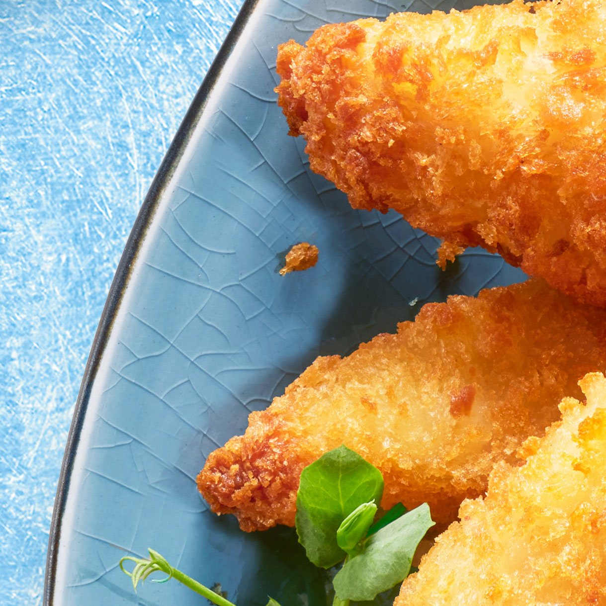
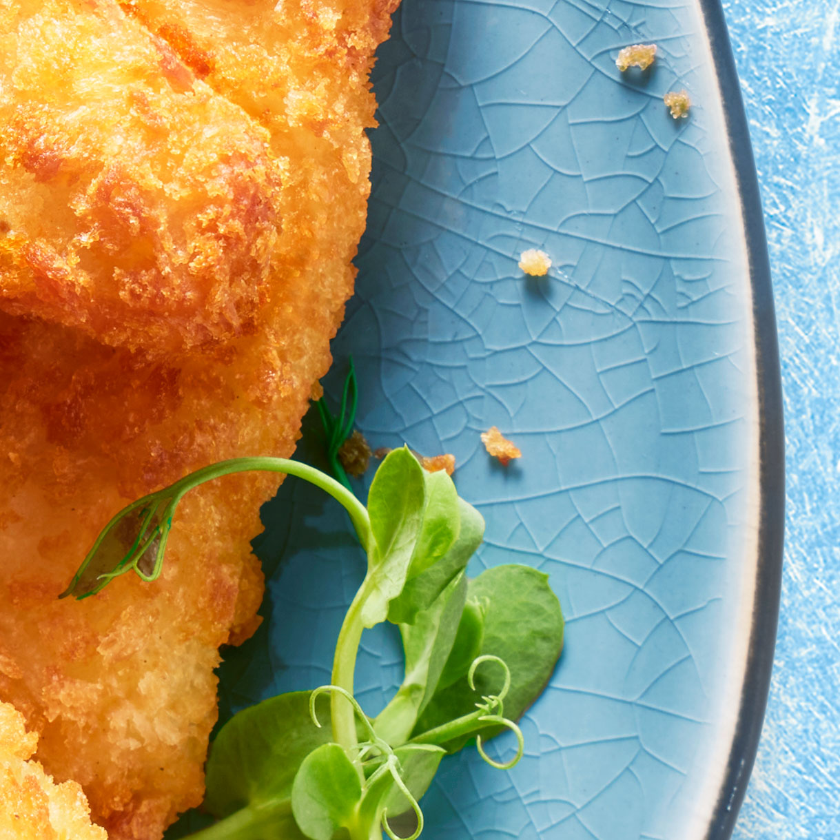
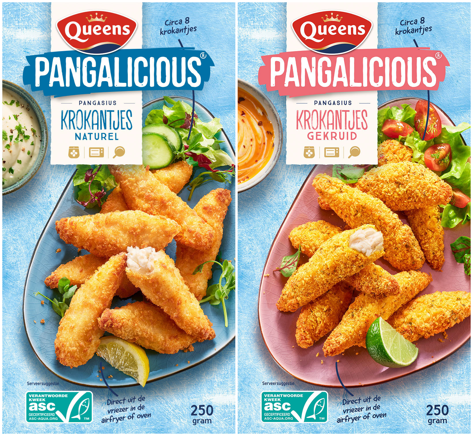
As a verpakkingsfotograaf in Amsterdam, I’ve had my fair share of challenges when it comes to capturing the perfect shot for packaging design. But when Queen’s frozen fish products asked us to showcase two new flavours of their viskrokantjes (breaded fish fingers), it was a whole different level of tasty trouble. These crispy bites need to look so scrumptious that you can almost taste them through the packaging. But that’s easier said than done, right? Especially when you need to highlight the golden, crunchy crust while still showing off the soft, flaky fish inside. Add the need to keep every element in place for the packaging design by BRUM, and you’ve got a real puzzle on your hands!
When working with breaded snacks like bitterballen or kroketten, the key challenge lies in showing the texture of the product without losing any detail. The crust can easily blend together, especially when multiple pieces are stacked on top of each other. We worked closely with food stylist Oliver Knight, a master in the craft, to make sure each piece stood out while maintaining that irresistible golden crunch. Styling the props in matching colours to the packaging design was another crucial element to ensure the product pops on shelves. This attention to detail not only makes the product look mouthwatering but also reinforces the branding colour coding – an essential part of the packaging’s visual impact.
After the shoot, the magic continued in the beeldbewerking phase. Post-production is where we really elevate the image to match the quality and appeal of the product. The key is to keep the natural look of the fish fingers intact, while enhancing their texture, colour, and crispiness. By adjusting lighting, shadows, and even fine details of the breading, we create a polished image that makes the product shine. With the right mix of styling, photography, and post-production, the final result isn’t just a photograph – it’s a piece of visual marketing that practically jumps off the shelf.